I got switched into the class after a week of working, so I had to catch up by picking one picture as my source of inspiration for the project. I chose a picture of a reflection of myself in a shattered mirror. This picture was a screenshot from a video that my church filmed for a series for my youth ministry and the series was called Shattered. Throughout the video, a person is speaking and this is what he says during the video, "In the beginning, God created us unique, beautiful, as He intended. Somewhere along the line, the world beat us down and tore us apart, and now we end up looking at ourselves, and what we see hurts us. Our lives look like broken glass, only allowing us to see distorted images of who we really are. We're shattered. But then, God, who sent His only Son, puts us back together. He picks up the pieces, restoring us to who He created us to be, allowing us to see the beauty He put inside us, no longer shattered." I thought that this picture is a beautiful representation of what we look like without Christ in our lives, we are shattered because of the world and the world's ways. I think that this picture represents me, and can represent everyone in general. The world can beat you down and tear you apart and that's just life. But, only Christ can make you whole, and I would love to end up doing a piece that represents that great piece of my life and of my story because without Christ, I'm shattered. Below is the picture that I chose to draw, and the progress along the way.


This was my only thumbnail sketch that I drew before I started my final drawing. I played around with the colors though, and eventually came to a decision to use purples, browns, and dark blues in place of using any black in the drawing.

I started out with the highlights in the picture, and I had just started the darker portions!


This is the final product, and I am very happy with it. Since the original picture was blurry, it was very hard to make Prisma colors seem as blurry as the picture, so that was one struggle I came across in the process of making this. I was happy in the end with my decision to do dark purples, browns and blues as my darker shades that went in place of any black I would need in the darkest parts of the drawing. I think that the use of those colors prevented my drawing from looking extremely flat and boring looking. I really enjoy using the colored pencil medium and I had fun being able to blend the colors and get to experiment with that. I also enjoyed the whole idea behind this project because I think it was a good way to show others what you want to reflect and what things are most important to you, or even what your interests are. Overall, I'm very content with what I drew and I know that it was to the best of my ability.
Oil Painting Apples
After having painted these two apples (partially), I realized that I have a very strong dislike for oil paints. This was my first time every using oil paints, and we had to paint apples. The apple on the top is one that I painted using brushes. I'm not a fan of how easily the paints blend together and how if you over blend, it's too late and it looks like mud. It is just overall just a very different experience than using acrylics which I love to use. The apple on the bottom is an apple I hadn't quite finished yet, but it was only using a palette knife, and man was it difficult. It requires a lot of control of the knife, which I didn't have. I also didn't like how thick it had to be layered on in order to spread the paint and blend the colors the way you want them to. After practicing these, I realized that I am not a fan of oil paints, nor am I good at them, but it's okay because every medium isn't for everyone. Everyone is good at something different, and after these exercises, I realized that oils are not one of them for me.


Oil Painting - Under My Umberella
For this piece, I had to do the painting in oil paints. Our topic was everyday objects in unusual places. I chose to put drink umbrellas outside in the grass, when one would usually expect to see a normal umbrella outside instead. I had a difficult time with the oil paints again, mostly because I'm just not the best at using these types of paints. It was difficult for me to get the colors that I wanted, and it was also difficult to add in all of the dark and light values over top of my base color of the grass because the colors blended together so easily. The oil paints are also more difficult to use for my because it was hard for me to make precise lines since the colors all blend together very quickly. I did learn a lot from this project though. I learned how to make different strokes with the brush, and I learned that if you want to, you're able to add texture into the painting since it has to be applied so thickly. I know that if I were to do another painting using oils, that it would probably turn out better since this was my first project using this medium and I know how they work a bit better now than I did when I first started the project. Overall, I don't PREFER to use oils, but I wouldn't be completely opposed to using them again. I wasn't super impressed with my work on this, but I was proud of myself for getting it done.


Interior Spaces using Prisma: Moon and Lola
For this project, our job was to create a piece that represented an interior space. I chose to draw my piece based off of a picture from a small boutique in Downtown Apex called Moon & Lola using Prisma colored pencils. I really enjoy using Prismas, so I enjoyed doing this project a lot. I didn't really run into any major problems while working on this project because I knew that my composition was the way that looked best, and that the colors I chose to stick with would look rich using the Prismas. The only struggle that I ran into was using so much white for the background. That was kind of difficult to do and make it look right. It was also kind of hard to make the different shades of white so that you can tell the difference between them. I think that I could have added more value to the window frames because they look a little bit flat. I also could have made the highlights more bright on the left cushion to make it stand out more. Overall, I was very pleased with the way that this project turned out because the colors came out very nice and I was able to blend very well. I almost like my drawing better than the actual picture because the colors are a lot richer in my drawing. I think that this piece is my favorite Prisma piece that I've ever done so far, and I think that I have found the medium that I am the best at, which is exciting. I loved this project a lot and enjoyed the whole process.


Nature Turns Mechanical
For this project, our job was to think of something in nature that we could change into either fully mechanical or partially mechanical. I chose to do an octopus, because I knew that I could make the tentacles mechanical and make it look pretty cool. I chose to do Prisma color again for this project, because I know that it's the medium that I excel in the most and I love the rich colors they bring out. In the beginning, I hated the idea of nature turns mechanical so much, that I wasn't looking forward to the project at all. I had a bit of difficulty drawing the smaller mechanical parts in the tentacles, and I was afraid that they color choices of gold and silver would make the drawing look boring. Once I started to draw the skin of the octopus, using the yellows, reds, oranges and pinks, I started to really like how it was turning out, and I began to like the project a little bit more. Once I added the blues for the water, I liked the contrast of the warm and cool colors against each other because the blues of the water made the warm colors in the octopus pop more. I decided to add in the skyline because I thought that it would make the idea more interesting and it would make it look like the octopus was attacking the city with its mechanical parts. Overall, this isn't my favorite piece, but I'm glad that I had the experience of trying a different idea than I would normally do because it showed me that I am capable of branching out. I like the way that it turned out because I got to practice contrasting warm and cool colors.


Self Portrait
For this piece, we were required to do a self portrait that had an interesting composition that would catch the eye. I chose to use Prisma colored pencils for my medium, because I knew that I wanted my color palette for this project to be rich and vibrant colors. I decided to use a picture that was taken of me for my senior portraits to use as my guide on this piece. I decided to go with blue, pink, and yellow for my color pallette because I knew that it was an uncommon one to use, so it would make it visually appealing, and the colors are also the three primary colors. The first thing I did was determine where the three different values would be in the picture, and then I drew those values on paper. I then proceeded to draw the colors in, until I had finished everything but the background. I knew that I wanted to continue the blue in the background, but once I added the blue in, something seemed to be missing. I then decided to add in the light rays of pink and yellow, coming from the direction of light in the actual picture. Overall, I really liked this piece and was content with it when I was finished. It's not like anything I have done before, and I was glad to have more variety. One thing that I need to work on is remembering to erase my pencil lines so that they don't show through my final piece.


Visiting North Carolina State School of Design
When visiting the school of design at NCSU, we got to tour the school and then had to go and work as a group to solve a problem in a practical way. My group's problem was that we were given a vacant parking lot right next to our high school and we had to come up with a practical use for it that would be beneficial to the school. After a lot of discussion and planning and coming up with ideas, my group came up with the idea to build a miniature student union that would have a couple food options, spirit wear, a study hall, an outdoor section with tables where students could sit and eat lunch, and a small parking deck that teachers could use to park in towards the back. Overall it was a good experience and I'm so glad I got to go and do that and see what it was like to go through the design process. The picture below was our board with all of our processes and idea webs.

Mentor and Mentee Combined Project
My mentee and I had to do a combined mixed media project to make a collage. We worked together to pick the color scheme, and find interesting things to incorporate. I helped my mentee with working on composition of pieces to make it visually appealing. If we had a bit more time to work on it, I'm sure it would have looked better, but below is what we got done with. I look forward to working with my mentee more!

Pet Portrait
For this project, we had to take a picture of one of our pets and do a pet portrait. I chose to do my pomeranian named Teddy, who passed away two months ago. Because it's close to Christmas time, I found it appropriate to use a picture of me holding Teddy in a santa hat, by the Christmas tree and the mantle by the fireplace. I chose to do Prisma colored pencils for this piece. I really liked the composition of the picture, and I think it captures the Christmas theme very nicely. I had to do a lot of detail for this piece and that took quite some time. I learned that when I did the tree, I didn't only have to use greens and browns to make it look right, but there's actually quite a bit of blue that I added in there to make it look interesting. I learned that it's very difficult for me to create fur and make it look the right texture. For the most part, I'm happy with the way the final product turned out, except for the fur. I need to work on learning new Prisma techniques so that I am able to make different textures look life-like. Overall, I would say that I learned quite a bit from this piece, and it definitely has helped me in this medium.


Landscape Painting
For my landscape painting, I chose to do watercolor. I chose to paint a picture that I had taken in Haiti on a mission trip. I really liked the composition of the panoramic view of the photo. This was my second time using water colors, so I was a bit scared to start the process. I had to test out lots of different paint strokes in order to know what I wanted to do for the water. I decided to soften the color palette for this painting because there was something serene about being there in Haiti. I used water color pencils to do the tiny details, such as the tables in the background and the outlines of the rocks. I also used the blue water color pencil to add minor details to the waves. Overall, I liked the way that this turned out. If I had more time, I would have probably tried to do more detail to make it look a bit better. But for my second watercolor piece, I feel as though it turned out good.


Concentration Piece 1: Anxious
My concentration is "what anxiety feels like". My first piece is best described as though you feel like you're in an ocean and you're drowning. I decided to do a photo transfer using gel medium, onto the canvas board. I then decided that I was going to use water colors to completely cover the transfer and recreate my face. Using the water colors in this piece was the third time I've used that medium, so it was a bit easier than my past two experiences with it. When I had completely covered my face, I liked the way it had turned out so far and I was afraid to go over it and fill in half of my face with water color waves. I procrastinated doing it because I've felt awful from being so sick. I practiced doing some waves on other paper so I didn't mess up, but once I actually tried it on my piece, I knew it wouldn't end up looking good. I wish I had known exactly how to do the waves the right way before I had started on them. Overall, I am happy with the way that just the face turned out without the waves, and I'm glad I was able to accomplish that much. If I could redo it, I would definitely learn how to do better transparent waves.


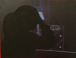
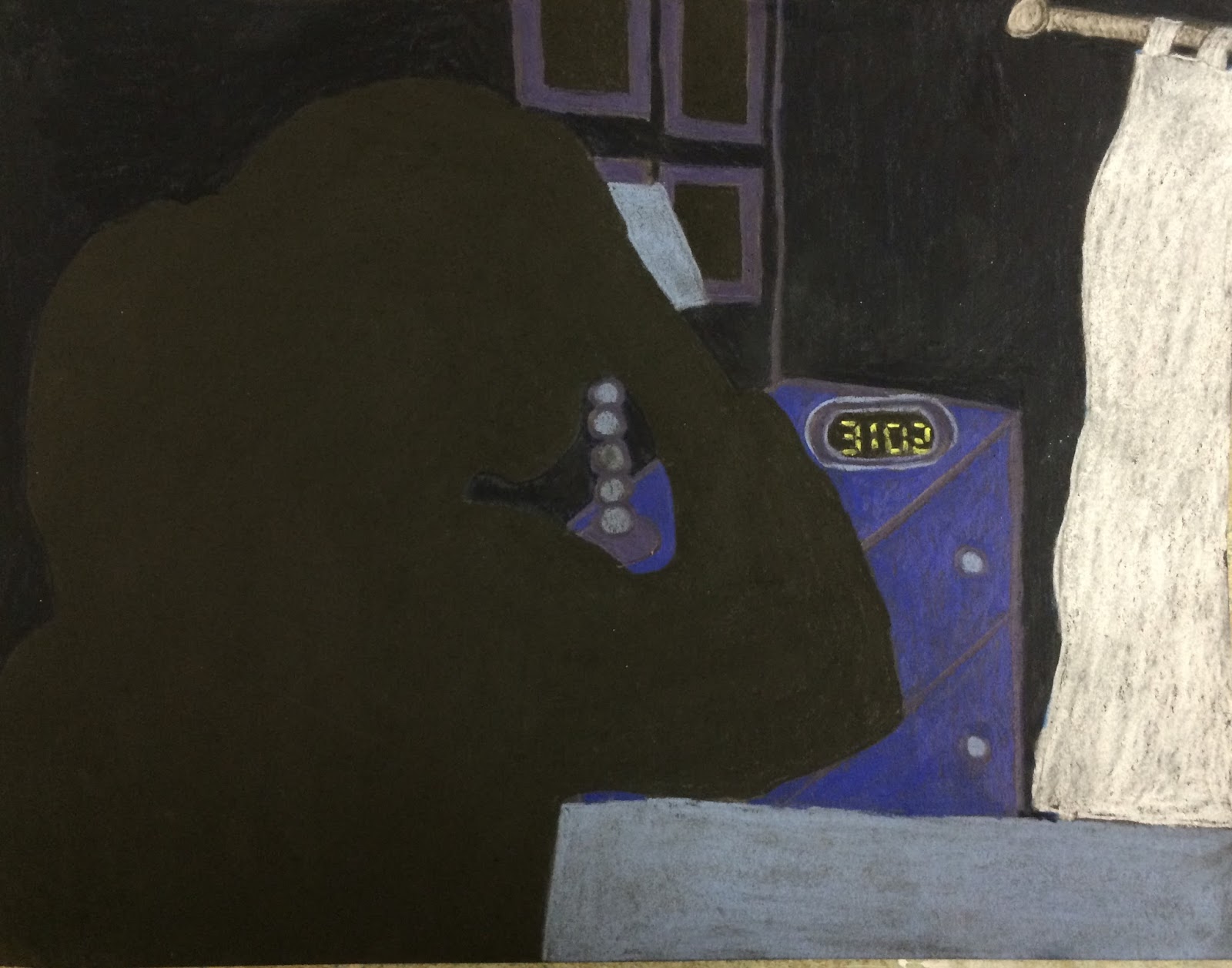
Concentration Piece 2: Lonely
For this piece, I was creating a picture of myself, waking up at three o'clock in the morning because of anxiety. I did a silhouette of my figure in my bedroom, putting my hand on my head. For this piece, I used chalk pastel pencils, which I had never used before (hence the quality of the piece). I had this great idea in my mind about how I wanted it to look, but it didn't really turn out how I wanted it to, mostly because of the amount of time we have to work on each piece and the fact that I was already behind. Using chalk pastel pencils can be difficult, especially when you use them for your first time. I liked the concept that I had, and I liked the idea of using a medium that I had never used before, but it just didn't come together how I wanted it to. If I could go back and redo it, I would probably rethink my concept for this piece, and think of some more things that I could add to it all to make it look like a more elaborate piece. Overall, it was a good learning experience, but I just wish it didn't have to be a part of my portfolio.

Concentration Piece 3: Scared
For this piece, using the concept of anxiety, I did a scene that would usually make me anxious. Using Prisma colored pencils, I drew a doctor's office, and included a rolling tray that had a syringe for a shot laying on it, which is the part that causes me to have anxiety. I decided to do a spin on it, and instead of drawing the scene realistically, I decided to use pinks and purples because they are calming colors to me and colors that I love. This piece is supposed to represent something that would make me anxious, but how it doesn't anymore by my use of the colors that calm me. I really like how this piece is very different from anything that I've done before, because I only used a select number of colors when I usually do realistic-looking pieces. It was kind of difficult for me to know what colors to put where, and that was a setback during my time creating this piece. If I could change anything about this, I would change the way that I drew the rolling tray. I would change the perspective of it a bit, to make it more prominent. I would also have changed the placing of the colors I used, and I would have learned more about how to use two or three colors in a piece. Overall, I liked the concept that I came up with! I am excited to see how my pieces grow.


Concentration Piece 4: Loved
For my fourth concentration piece, I was kind of stuck on what to do. With so little time to be able to finish each piece, it's hard to use the concept of anxiety, and actually think of a really good, elaborate idea. So, I ended up deciding that I wanted to take a moment in my life that was the opposite of anxious, a calming moment where no anxiety resided in me, and I felt loved. I chose to draw a picture of two little Haitian girls and I, that I met during my time in Port-au-Prince, Haiti. I very clearly remember that moment because I was unexpectedly able to communicate with them because I realized that they spoke a little bit of English! It was one of the most joyous, calming moments of my life, and it was a moment where I felt so incredibly loved by these two girls. I knew that it was the picture that I had to use for my next piece. I decided to go with Prisma colored pencils because they are the medium that I love to use. Using tan paper, I sketched out the figures in the foreground of the picture which was the two girls and myself. I started out drawing my hair, and realized that I really liked the way that the piece was coming along! When I started to work on the girls' hair, instead of using all black, I used half black and half blue to make sure that it didn't make the piece look flat. In this piece, I did A LOT of blending using the blending pencil. To make the colors work together and make the picture stand out, I had to change the colors of the girls' shirts and change the color of the tile in the church. One thing that I realized that I actually love to do and am good at, is drawing people with dark skin. When I started on one of the girl's faces, I realized that I really enjoyed doing that. Overall, I am so glad that this was the picture I chose to draw, and am so so happy with the way that it turned out! I think that out of all of the pieces that I've done so far, that this is my favorite piece and it shows how much I have grown as an artist.


Concentration Piece 5: Ecstatic
For this piece since I have developed my concentration into emotions in general, I chose for this piece to be called "Ecstatic". The original photo was a photo taken of my best friend and I on the day of our junior prom. We were both excited for prom because we both felt so beautiful in our gowns. I chose this photo because after doing my 4th concentration piece, I realized that I loved drawing darker skin tones, and my friend Soren is half black and half Korean. I also chose this photo because I thought that it represented the emotion of being "ecstatic" very well by our facial expressions and placement of our hands and arms. For this piece, I chose to do Prisma colored pencils again. I was somewhat skeptical on if I'd be able to do the sequins on my dress well, and make it look like it actually shined. But once I started, I realized that all I had to do was do tiny white dots in a variety of sizes, and then add a thin layer of blue back over some of them. Once my dress was finished, I was very satisfied with the way it looked. Overall, I really like the way that the piece turned out. I loved everything about it and I didn't really have any struggles throughout it, except maybe the water. That was a bit difficult because in the original photo, it was almost all white because of the sun. I went in and used purples and light blues to tie it into the dresses and bring the piece together. I am very happy to be able to include this piece into my concentration, especially because our faces are recognizably our own.


Concentration Piece 6: Peaceful
For this piece, I chose to do the emotion of feeling peaceful, or feeling at peace. I chose to go off of a photo that was taken of my sister and I kayaking in the ocean at a beach in the Bahamas. That was a peaceful moment for me, because that was spring break and I had nothing to worry about, and I was in a beautiful location with my sister. I was at peace. So I chose to do that photo in watercolor and pen, mostly because I knew it wouldn't take me a long time, but also because I hadn't done watercolor and pen before so it was a nice change. I just started with pen, and did the outline of all of the shapes. I then took watercolor pencils and did all of the small details first, like in the hair and in the orange kayak. I did struggle with getting as much detail as I'm used to in the rest of my pieces because it's a lot harder to obtain as much detail as you'd like when using watercolors. I then went on and used regular watercolors to do the ocean and the bigger portions of the picture. Something else I struggled with was getting enough variety in color in this piece, and that's something that I will need to work on if I do another watercolor piece. Overall, I'm somewhat satisfied with my first watercolor and pen piece, but I just wish that I wasn't under these time constraints so that I would be able to take more time on each piece.


Concentration Piece 7: Hopeful
For this piece, I chose to do a photo from when I was in Haiti. This photo was taken by me the first time I was about to walk into the church where I would be serving in Haiti. I was hopeful for what could come of my trip in Haiti. It was such a moment of feeling hopeful for me. I chose to do Prisma colored pencils for this piece, and I'm sad because I lost all of the in progress photos that I had on my phone. One thing that I struggled with in this piece was the amount of time that I gave myself to do it. I feel like I never have enough time to be able to put my all into each piece that I do. Had I had more time, I would have liked to include all that was in the photo, which was another person on the right and more trees on the right as well that created some shadows on the building. I feel like that would have pulled it together more overall. Regardless, I'm happy with what I was able to do in the amount of time I allotted myself. I do wish that I had put a bit more detail into the tree though. But overall, I am happy with the way that it turned out.


Concentration Piece 8: Sad
For this piece, I had to choose an emotion that was hard to just capture on camera, but I found a photo that represented feeling sad. I chose to do a photo of my dog outside of the door, waiting to come inside. Nothing would normally be sad about the photo, but it was a sad time for me because the photo was taken the day that my family found out that he had to be put down because of a tumor that was growing in his tummy. I chose to do Prisma colored pencils again because I know that's what I'm best at. I wish I had a better photo and composition for this because it could have looked a lot better, but the composition was easy enough for me to do in a short period of time so that I could just get it done. I didn't really struggle with anything in this piece, but again, I just wish I had more time to do more detail in each of my pieces. I'm somewhat happy with how it turned out, I just wish that I had a better composition. Although I wish that, I feel as though the simple composition with not much going on shows how sad and lonely it was during that moment that I saw him just waiting outside for me to let him in for one of the last times.


Concentration Piece 9: Surprised
For this piece, I decided to go with the emotion of being surprised. I had just recently gotten back from a cruise that went to one of the British Virgin Islands, Tortolla. It was so beautiful there and my family and I were able to go snorkeling through a coral reef in the Baths. When I went, I didn't know what all to expect when I put my face in the water, so when I looked down and saw a beautiful array of colorful and vibrant fish, I was so surprised by the beauty of it all. I thought that one of the photos of me with my face in the water, gazing at all of the beauty of the undersea life, was a good photo to show a moment of surprise in my life. Again, I decided to go with doing Prisma colored pencils because I knew that they would capture the colors of the beautiful clear blue water of Tortolla. I started off with the huge boulders of the Baths. Those were a bit of a challenge for me because of all of the different colors of gray that were in the boulders. I had to make sure I blended grays with tans to make it look like there was light hitting the rocks. That wasn't my favorite part to draw, and I got frustrated with doing the "boring" colors of gray and tan. I then went on to draw the highlights in the water, and draw myself before I completed the colors in the water. The one thing that I struggled with this time, was making the color of my hair darker than I have previously made it in my other pieces because my hair was wet this time. That's one thing that I wish I had done a bit better. Overall after I had finished the whole thing, I was happy with the way that it all came together in the end. Looking at it really takes me back to the experience of snorkeling in Tortolla, and it reminds me of the surprised feeling that I had when I got to experience swimming through these beautiful coral reefs in the Caribbean.


Concentration Piece 10: Bored
This piece was based off of a photo that I took when I was at Pelicans, which is a snowball and ice cream place. My friend left to go get something from his car, and I took his snowball and started stirring it because I was bored while he was gone. I then saw that the blues from the different flavored syrups in the snowball were blending together and it looked really pretty. Before he got back, I decided to take a quick photo since I knew that I needed to do another piece for my concentration (emotions). This piece shows me mixing the colors because I was bored, and shows how I am still curious even when I'm bored. I decided to do Prisma colored pencils for this piece. When I started, I drew the basic outline of the figures. I then started with the umbrella pole, and did the cup after that. I had a lot of fun blending the blues and making them look vibrant. To do the shadows, I used periwinkle, light and dark purples and light blues and blended all of those together to pull some blue from the snowball. Overall, I actually really like this piece and the colors I chose!


Concentration Piece 11: Proud
For this piece, I decided to base it off of a picture of a cupcake I had made and bitten into. I thought that the photo had a cool perspective and the bite into the cupcake made it more interesting. I knew that with the colors in the photo, I could take those colors and brighten them up a bit more and make it more vibrant than even the photo was. Because I made the cupcake, I decided that the emotion that went along with it was feeling proud of what I had made. Since baking is something that I love to do, I was proud of how the cupcake that I made turned out. To start the piece, I started off in the foreground of the photo and drew the cake part of the cupcake. When I first drew it like it's shown in the first photo, it didn't show the air bubbles in the cake very well because I had over-blended the colors to where it looked too soft. I decided to move on, and then worked on the frosting. I used a total of five colors in the frosting to make the pinks and the darks really stand out. I had the most fun drawing and blending the colors in the frosting because I got excited when I realized it actually started to look good. After the frosting came the blackberry, which instead of using black for, I decided to use the "blue indigo" colored prisma pencil. I knew that using the blue instead of straight black would make the berry pop and not look flat. I then did the background, and after that was finished I went into the cake of the cupcake and darkened it up a bit to make it not look as soft, and to give it more texture. When the piece was done, I was actually very proud of how it turned out, which I found to be pretty ironic. Overall, this is one of my favorite pieces that I've done so far because of my use of the bright pinks, and how the berry and frosting turned out.


Concentration Piece 12: Content
For this piece, I chose to end on the emotion of feeling content. I chose to base my piece off of a photo of my friend and I in a strawberry patch, walking together. In that moment, I felt so content, so I knew that it was what I wanted to end with. Again, I chose to use Prisma colored pencils.

AP Art Presentation and Final Reflection
During the course of my time in the art program at Apex High School, I have had so much fun and grown so much as an artist. I really enjoyed Art 1, Art 2 and Art 3 during my freshman, sophomore and junior year. I was hesitant at the beginning of my senior year (this year) to take AP art because I thought that I wasn't a good enough artist to be able to really succeed in this course, but I was wrong. I have grown so much during the course of this year, and I have discovered that my favorite medium to use is Prisma color, as anyone can see if they look at my concentration. I got to do things in this course such as experiment with oil paints, water color, chalk pastel, pen and ink and then of course the Prismas. I feel as though the previous art classes I had taken had definitely prepared me for AP Art, and I am so glad that I went through with taking the class. During this year, I decided that I want to become an art therapist, so this class definitely helped me when it comes to college credits. I got to improve on my now favorite medium, which ended up being a majority of my concentration pieces. I am so happy with the work that I have completed, including the pretty bad ones. I got to see how my talent has progressed and grown over the course of not only my four years in Apex art classes, but the AP art class especially. Originally, I was only going to take Art 4, and not do all of the work that the AP kids were doing. I then decided that I knew I had it in me to get my portfolio completed. I also think it's interesting how my concentration had changed. It was originally going to be the concept of anxiety, but after three pretty unsuccessful pieces, I changed it to different moments in my life where I have experienced a certain emotion. Once I took it from there, I feel like the pieces turned out so good. I am so proud of how much I've grown in art and in my talent and passion. I can't wait to be able to help other people through the use of art and their imagination.
No comments:
Post a Comment